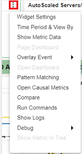

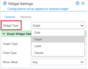
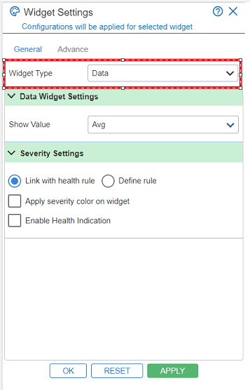
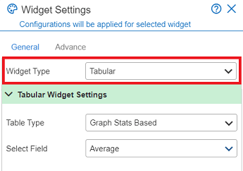
Data Widget Settings
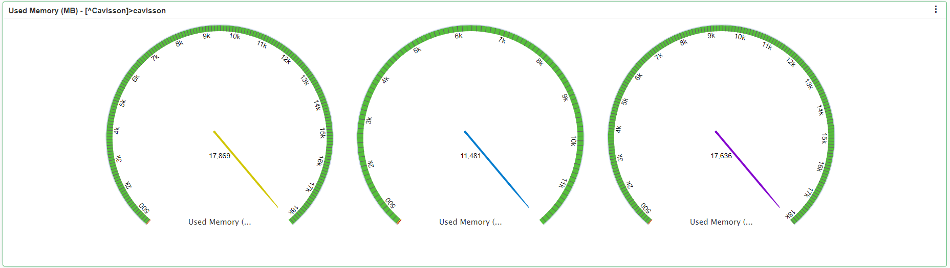
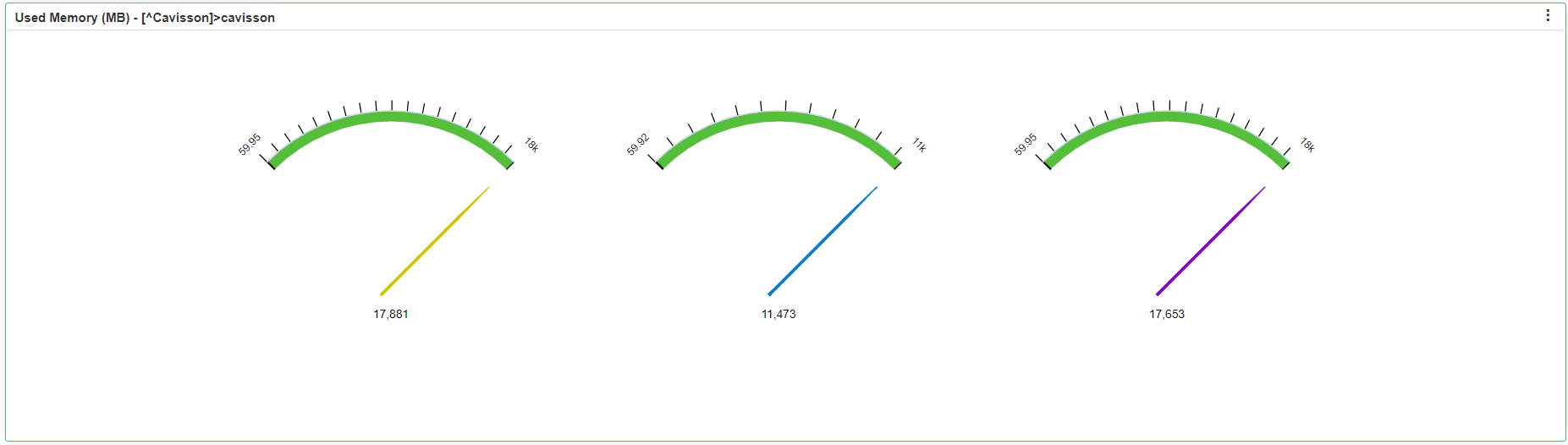
Show Value: It is the criteria of the data field. The available options are as follows:
- Average
- Last Sample
- Maximum
- Minimum
- Sample Count
- Standard Deviation
- Sum
- Vector Count
Severity Settings
In severity settings, the user has two options:
- Link with Health Rule: This option will link the severity settings with the health rule. It has following two checkboxes:
- Apply severity color on widget: If a user selects this checkbox, the severity color will be applied on the widget.
- Enable Health Indication: If a user selects this checkbox, the health indicator will be enabled on the widget.
- Define Rule: This option is used for defining a rule.
Note: The above two checkboxes are common for both the rules. In case of Define Rule, the user has to select the Metric Health Operator from the given drop-down and also needs to enter the Critical, Major and Minor values.
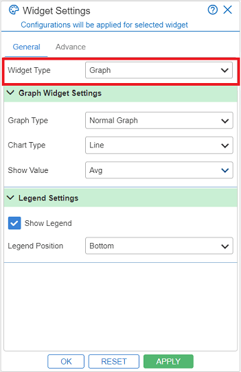
· Once you have selected the values for all the respective fields, you have to click on the Apply  button, to apply the widget settings.
· You can also reset the widget settings window by clicking on the Reset  button.
· To close the Widget Settings window, click on the Ok  button.
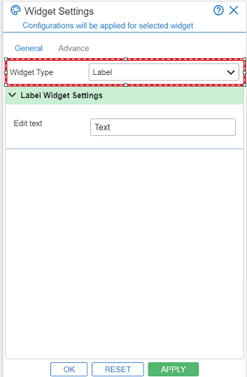
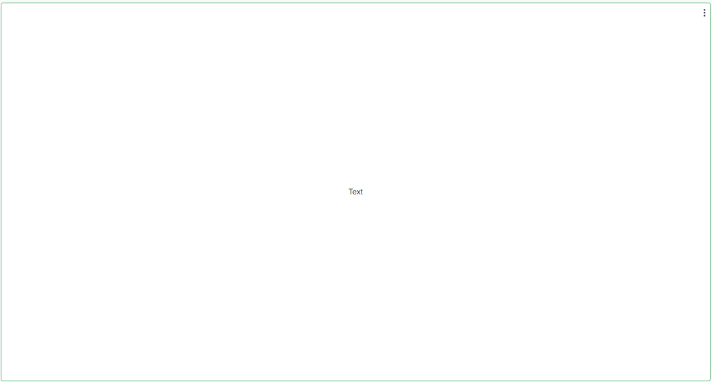
Widget Type – Label
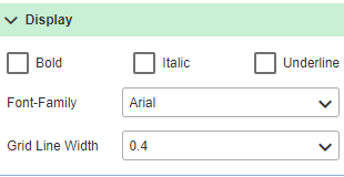
Label widget type is used to create a blank widget with just a label in it. The main purpose of this widget type is to provide a heading / title to a group of widgets and place those widgets below this label widget. Further to this, you can perform formatting on the created label widget, such as: bold, italics, underline, font size, font color, text alignment, and many other formatting.

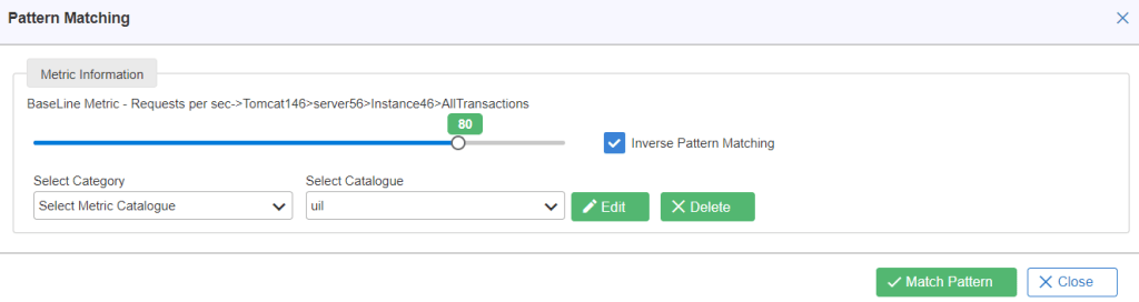
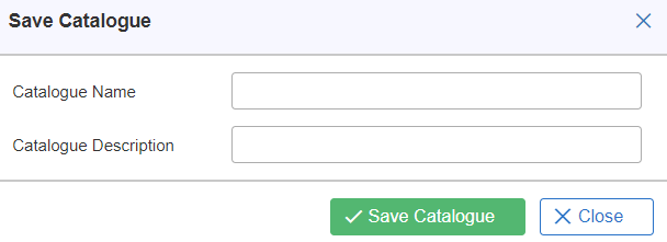
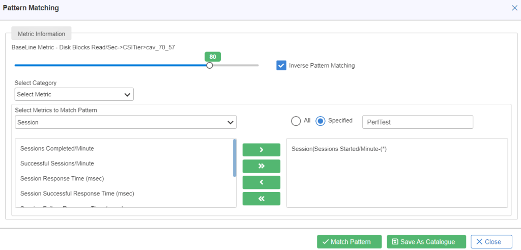
Note: A user has to Save a catalog first in order to execute the pattern matching option. For saving a catalog, the user has to click on the Save as Catalogue  button, and fill the catalogue name and catalogue description.
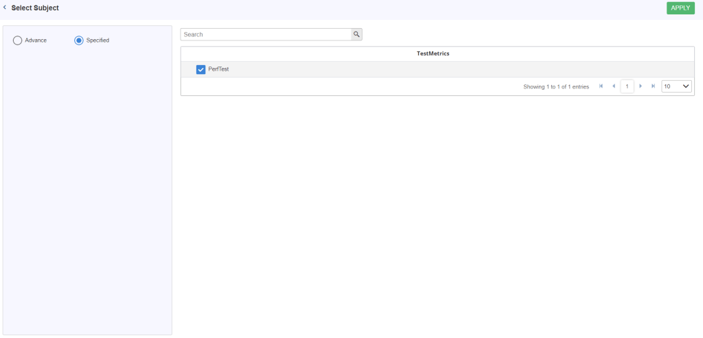
Window with Vector Group Selected: Two options are available for selecting indices – ALL and Specified.
- ALL: If ALL is selected, the Available Indices option is not displayed.
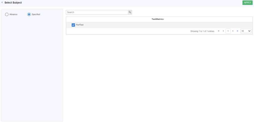
- Specified: If Specified is selected, the Select Indices link is enabled which opens a new window. If the selected metric is of vector type, a window is displayed to select vectors.
Delete: On clicking Delete  in the Pattern Matching dialog box, the saved catalogue is removed from the catalogue list.
Edit: It updates the existing catalogue which has been loaded for update. On click of the Edit button, the Catalogue management window is displayed with the following attributes:
- Name: Enter the name in the text box.
- Description: Enter the description in this text box.
- Select metric type: It contains two options. To select any metric type:
- Normal: To select the Normal radio button, Normal metric fields are enabled. You can add the metric.
- Derived: To click on the derived radio button, the derived metric is displayed.
- Select Graph (s): Click the Group name and select any metric in the left side of the text area and click >> to append in the right side of the text area.
- ADD: On click of the add button, graph is added in tabular format.
- Update Catalogue: You can update the catalogue successfully.
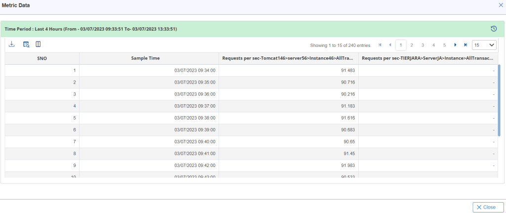
Sample Output
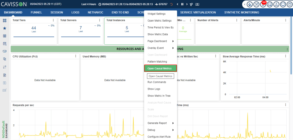
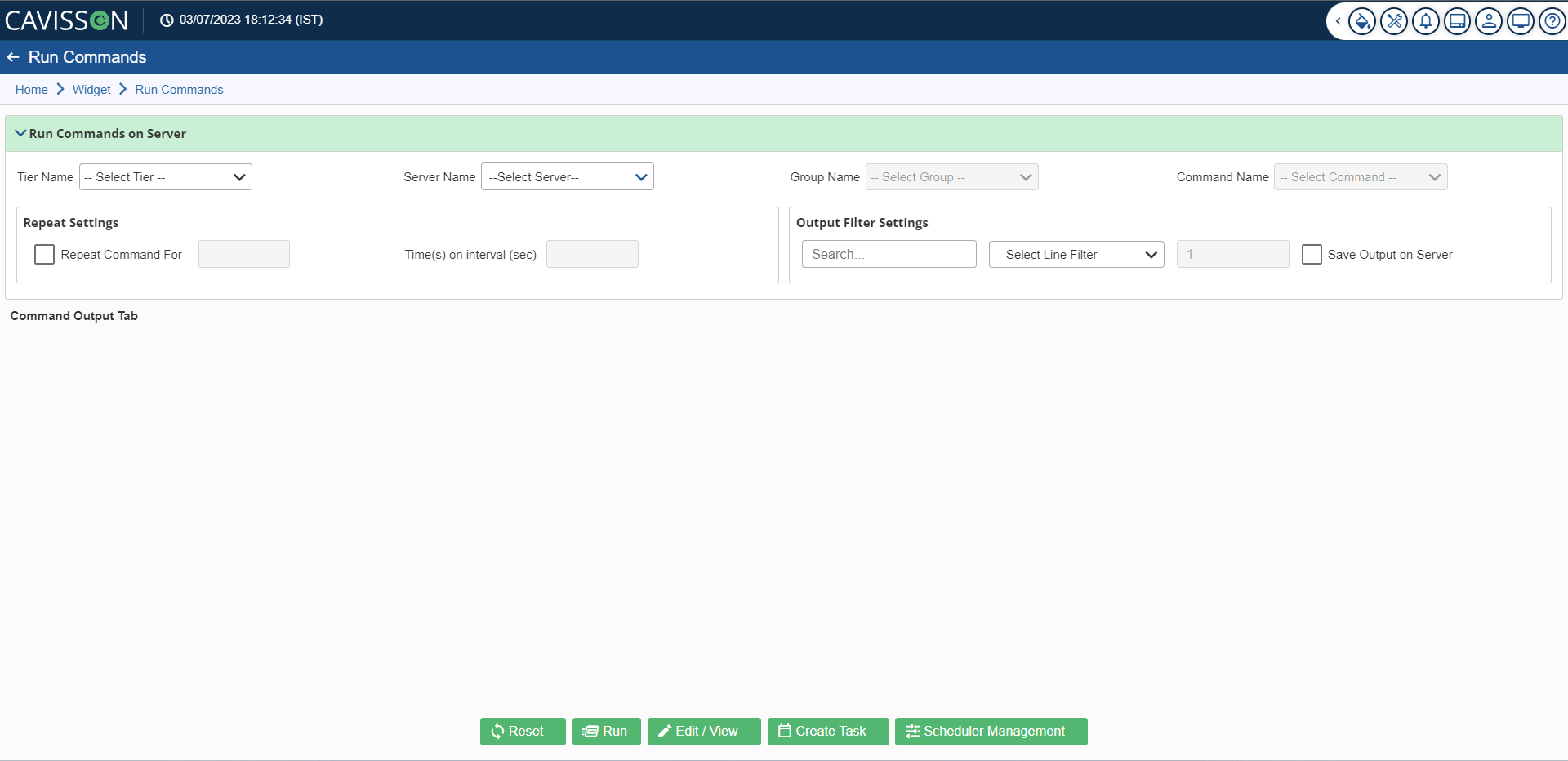
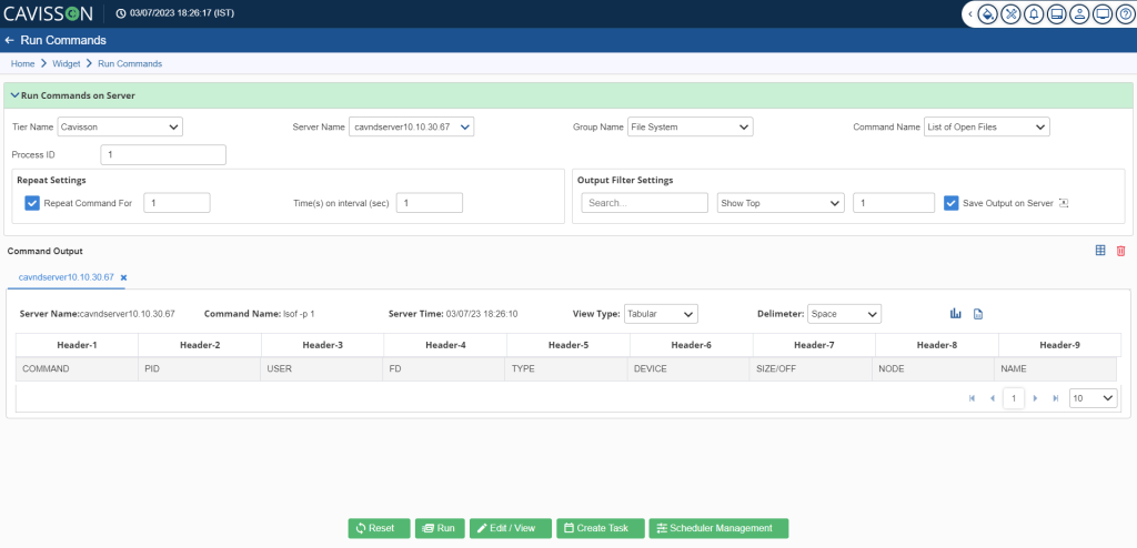
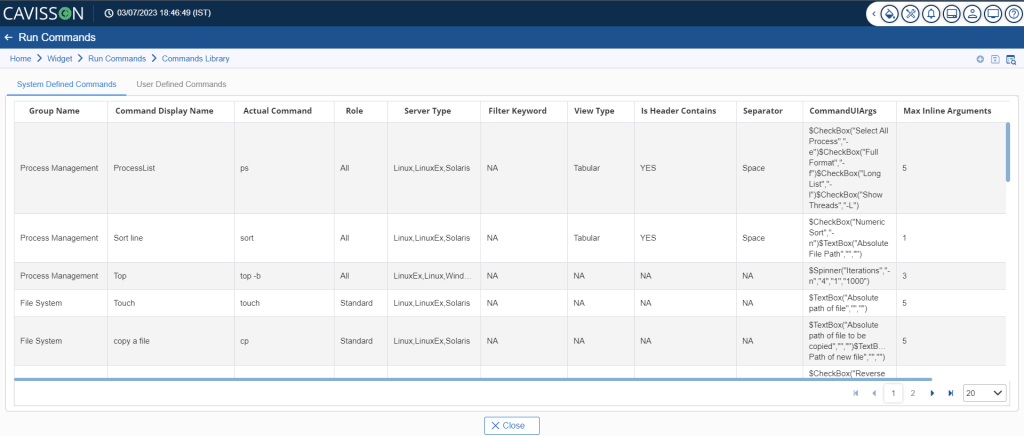
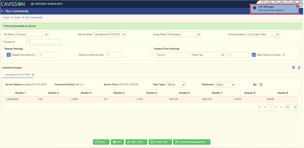
Run Command on Server
- Select the tier name, server name, group name, and the predefined command name that you want to run on the server. You may also need to mention some additional details based on the selection. To run a custom command, select Custom Group in the Group Name, select Custom Command in the Command Name, and enter the command.
- In the Repeat Setting, you can mention how many times you want to repeat the command and at what interval/frequency (in seconds).
- In the Output Filter Settings, you can mention the filter criteria and select whether you want the top rows or the bottom rows along with the count. You can also save the output on the server.
- Click the Run
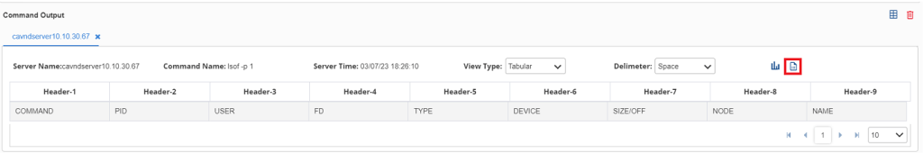
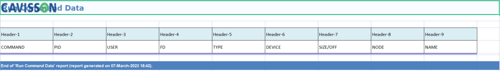
 button, the command gets executed and the output is displayed in the Command Output section along with several other details, such as server name, command name, server time, and view type (text/ tabular). In the tabular format, you can also specify the column delimiter (such as space, tab, pipe). The output is segregated in various headers based on the delimiter selection.
 button is used to clear the selections in the Run Command window.
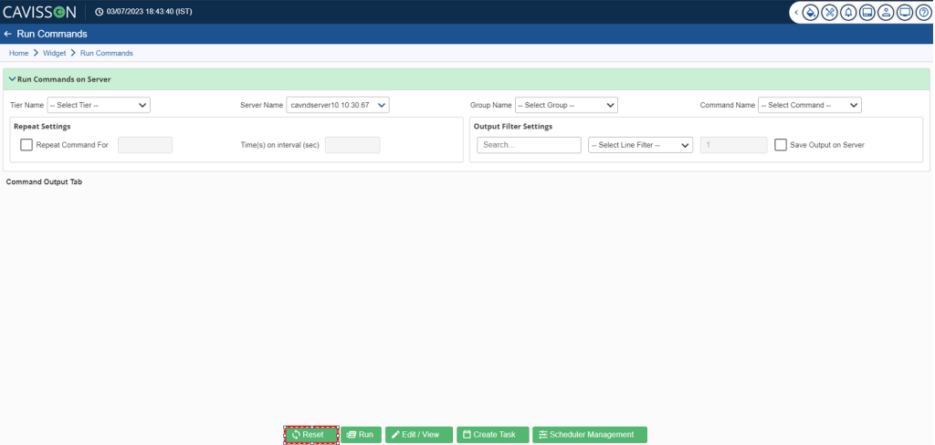
 and provide the following details in the Add Command Window as shown in below figure.
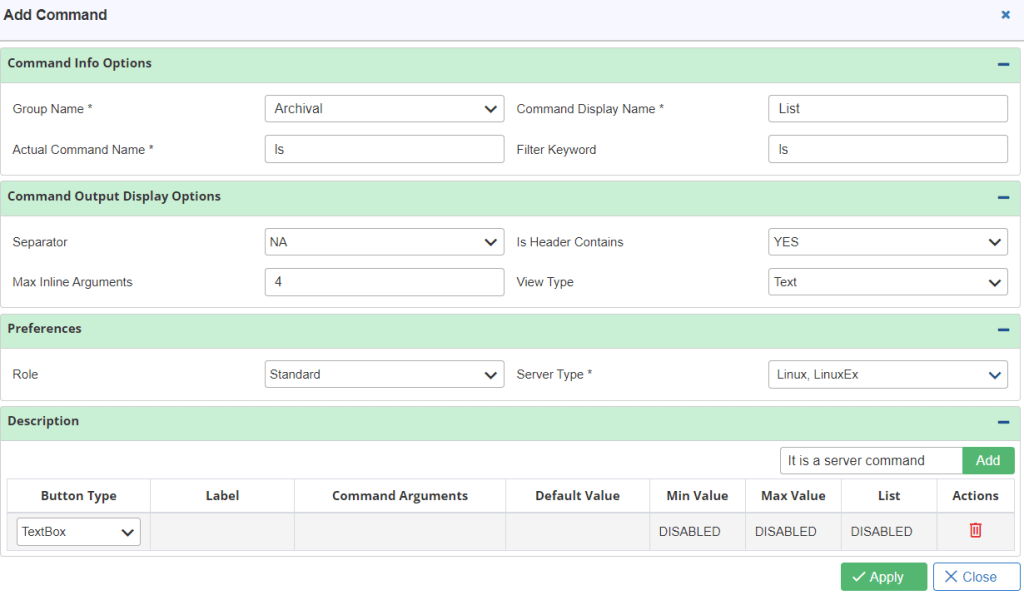
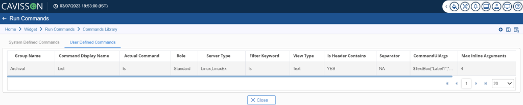
Note: There are the following options that a user can perform after adding a command which are listed below:
- Save Command: On clicking this option, the user can save the command. To perform this operation, the user has to click on the Save After a user click on the Save
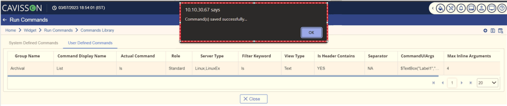
 icon, it will show a pop-up indicating the Command is saved successfully.
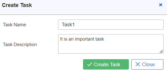
Enter the task name and task description. Then, click the Create Task  button, a confirmation message is popped up stating that the task is saved successfully as shown in Figure 215. Once created, that task can be re-run at backend after a specific interval of time or on any date through Scheduler Management. In the subsequent section, the scheduling of tasks is described.
 button.
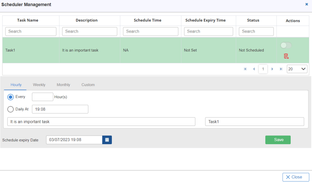
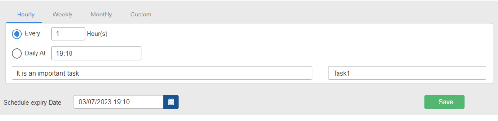
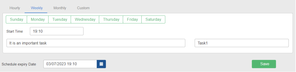
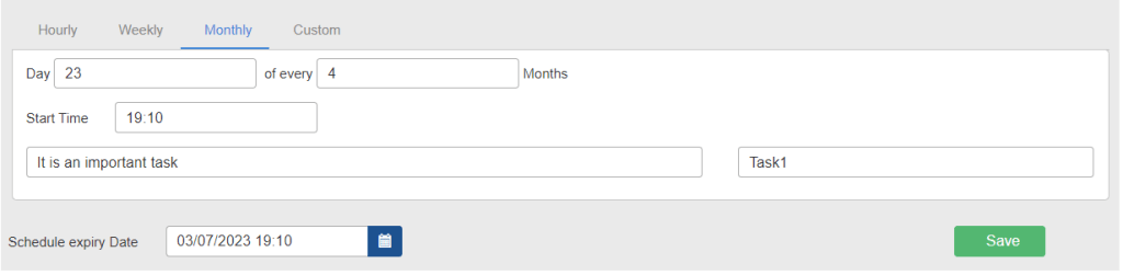
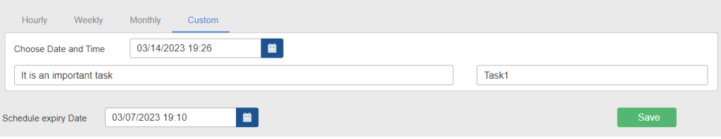
Note: User can schedule it on an Hourly, Weekly, Monthly and Custom basis. First, select the required tab and provide the details accordingly. Then, specify the Scheduled Expiry Date and click the Save  button. At this date, the schedule is expired and the task is not executed further. You can use the Disable/Enable
  icons to disable/enable or to delete a task click on the Delete
  icon.
icon.
Hourly
Note: If you want to close the window, click on the Close  button.
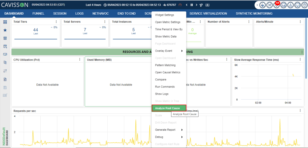
Root Cause Analysis
By using this feature, the user finds cause metrics for Root cause analysis using the classification of metrics. Also using the classification which will be stored with metadata in TSDB, the user will able to do integration point root cause analysis in case of a spike at integration points.
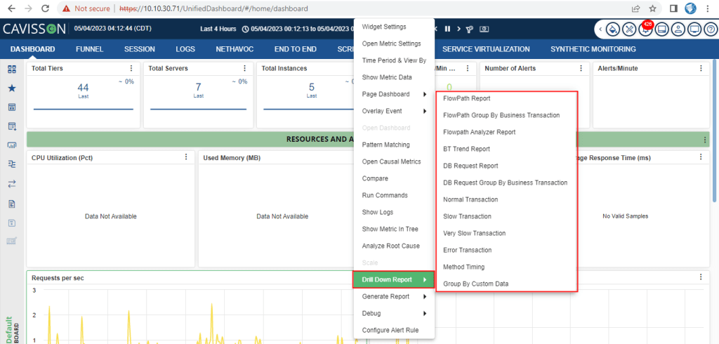
Scale
This feature is added to reduce the visualization and interpretation complexities arising from having large as well as small graph values on the same widget. Scaling enables a distinct display of very small values compared with very high values on the same widget. Two scaling modes are provided, logarithmic and auto.
Note: Once scaling is  enabled, icon is displayed over the widget.
Key Pointers
- Scaling can be changed/applied from the widget.
- If the scaling option is changed/applied from the widget, then it applies to that widget only.
- If scaling by specified metrics is selected, then on the selection of metrics from the lower pane or from the widget, the scaling is changed.
- From the configuration UI, you can change the default option of scaling.
- Using the Scaling Threshold value, you can scale the graph as and when needed and can calculate the Scale Factor based on that.
- The graphs, which are being scaled, are displayed with the dash and dotted line respectively.
- The scale factor is being calculated and it could be seen in the lower panel as ‘X’ (Scaled up) and ‘/’ (Scaled down), based on the nature of the graphs.
- The scale factor is displayed in whole numbers.
- A specific range is maintained for the graphs where scaling is applied and maximum graphs will have the Scale Factor as 1. For example: If the scaling threshold is 20 and the max value of the graph is 100 then all the graphs having values lesser than 100/20 are scaled with the Scaling factor Nx1. All the graphs having values greater than 100*20 are scaled with Scaling factors shown like Nx2 or Nx/3.
Example:
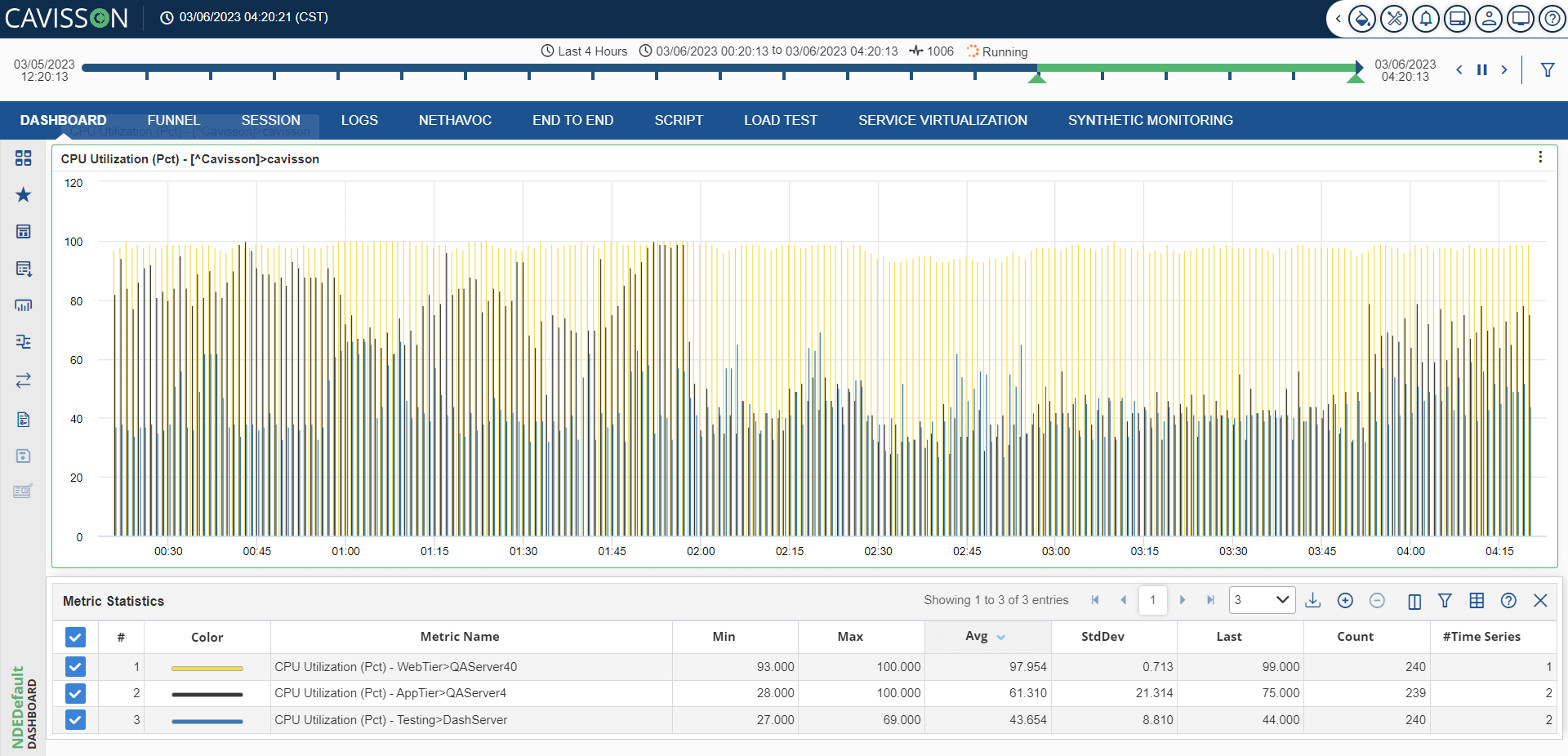
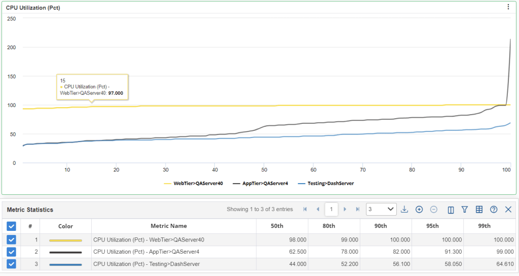
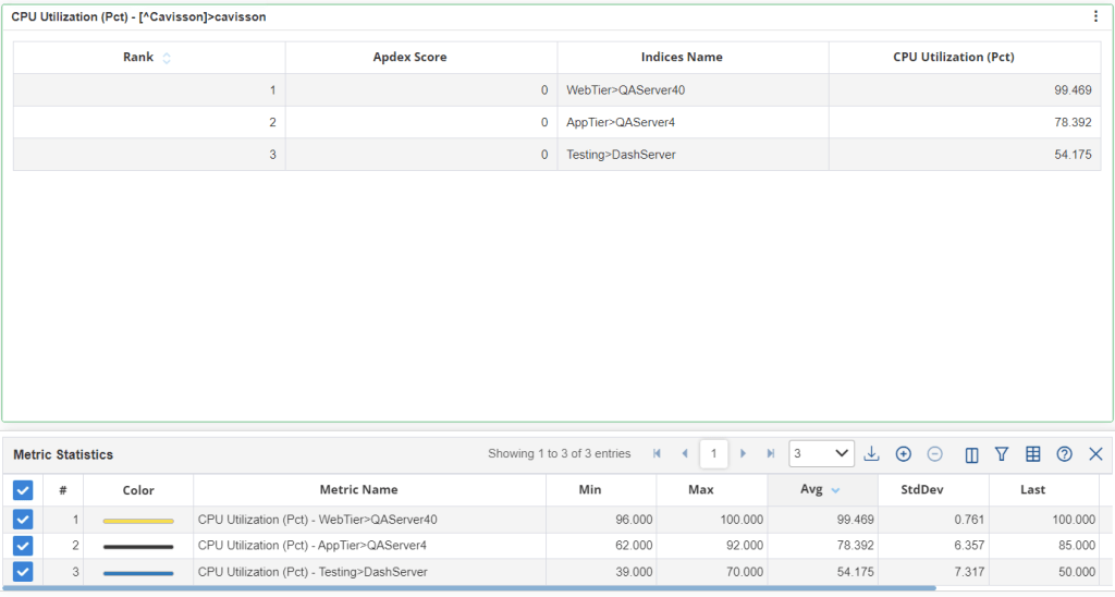
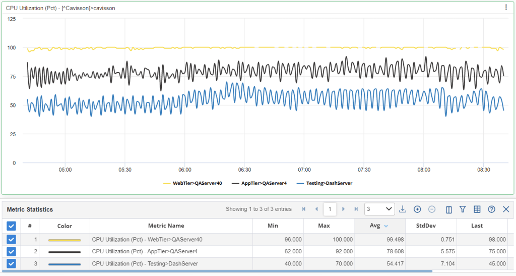
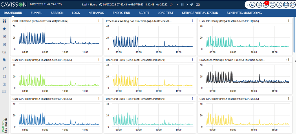
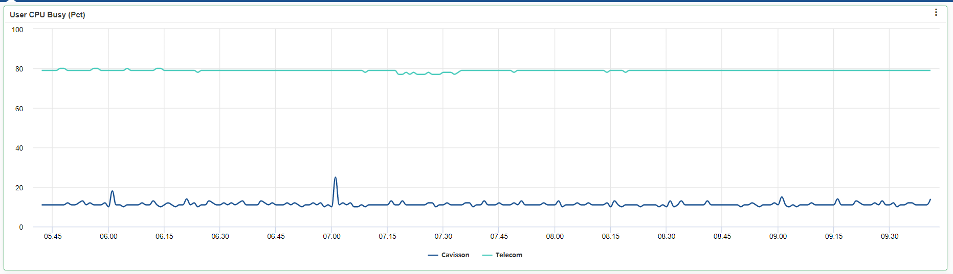
In the graph panel, there is a graph with low values (CPU Utilization) and hence it is difficult to view the graph data concerning the higher valued graphs.
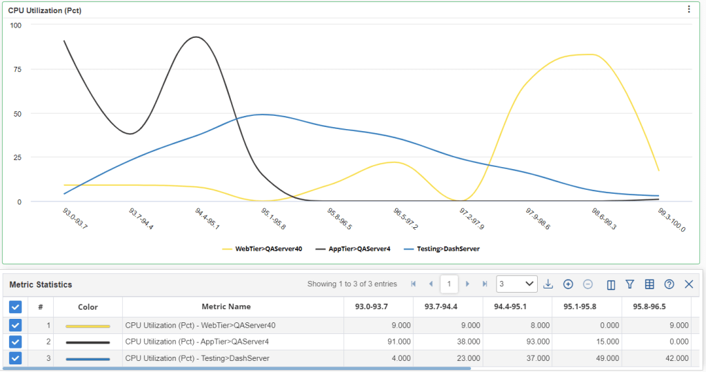
To have a better view, you can apply scaling on the graphs. There are two modes of scaling – Auto and Logarithmic.
Auto
This mode is applied to the graph having the highest value.
Note: The scaling factor is calculated and displayed in the lower panel automatically. To find the actual value at any instance, mouse over to that instance. You can change the scaling base metric by clicking if from the lower panel. Scaling is re-calculated according to the selected metric and redraws the chart.
Logarithmic
Here we can use logarithmic scaling to handle a large number of metric or graphs. In mathematics, the logarithm is the inverse operation to exponentiation, just as division is the inverse of multiplication and vice versa. That means the logarithm of a number is the exponent to which another fixed number, the base, must be raised to produce that number. In simple cases, the logarithm counts factors in multiplication. For example, the base 10 logarithm of 1000 is 3, as 10 to the power 3 is 1000 (1000 = 10 × 10 × 10 = 103); 10 is used as a factor three times.
Scaling Off
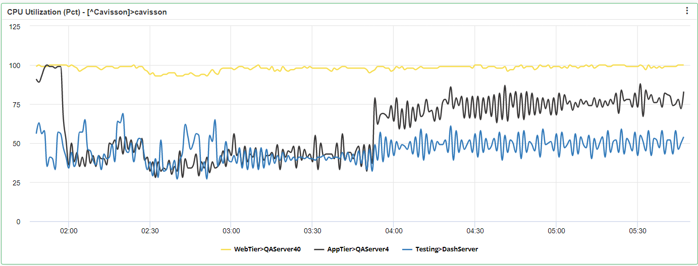
To disable scaling from the graphs, select Off from the scale menu. This laid the graphs in their original form.
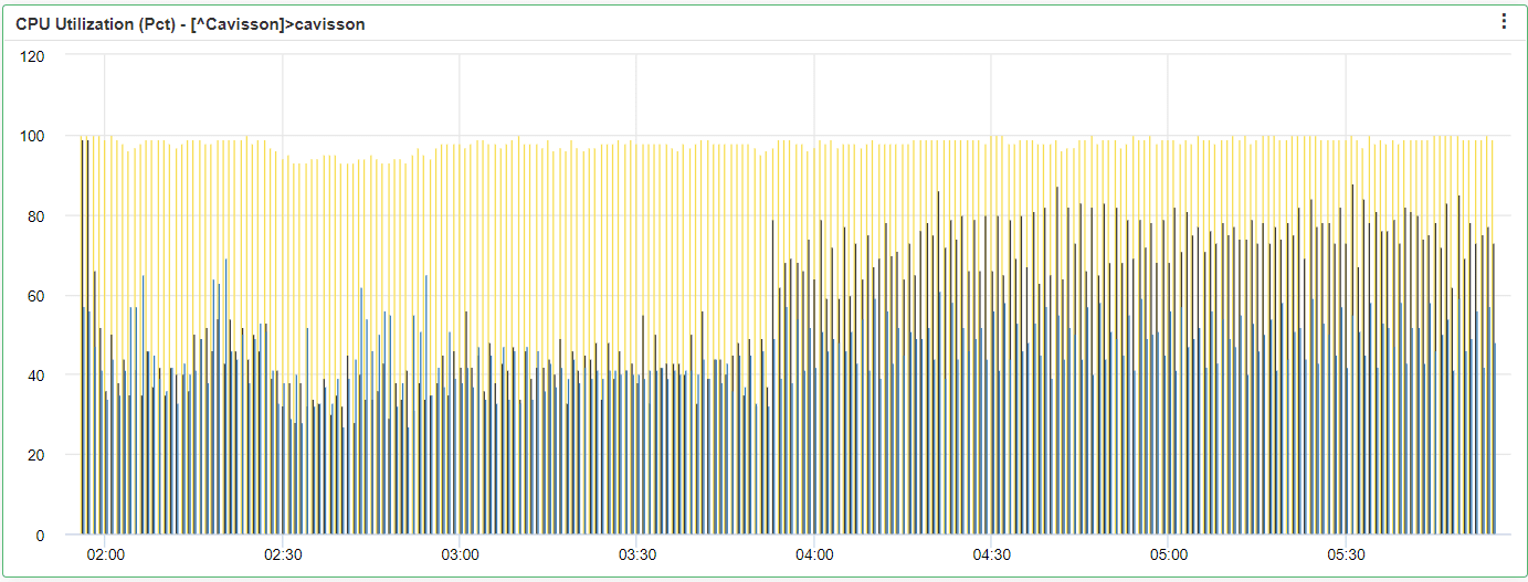
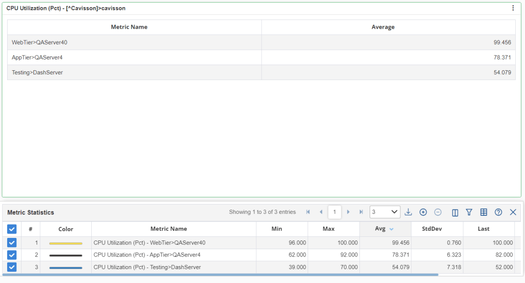
Area Range Graph
Area Range graphs is a chart type, which is applicable based on the configured threshold. This is implemented to resolve the UI slowness due to a large number of graphs on the panel. The area-range graph plots the higher value and lower value samples from a set of graphs, which makes it lightweight and quick to update and render.
Geo Country Map: This shows the map of the country which is selected in the Widget.
Widget Metric Limit: It shows the limit of the Widget plotted.
Widget Count limit: This shows the limit of the count in the widget.
Shows data points: In this, the data point is shown in the graph if samples are below the given limit.
Apply Zoom: Select this check box to apply zoom on widget.
Offset line: Select this check box to show the offset line.
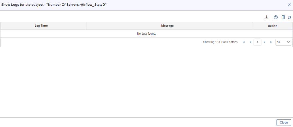
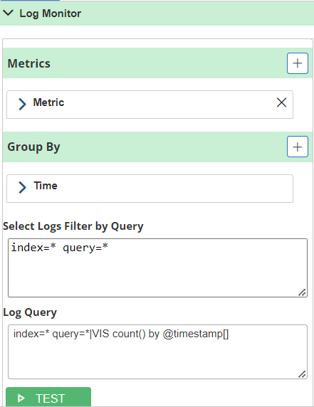
Shows Logs
This feature allows the user to correlate metrics information with logs generated by the application and helps the user to identify any issue reported in the logs.
It provides support for accessing logs from multiple sources including NetForest and Splunk. The unique proposition offered here is by having integration of logs during the Netstorm performance load testing which forms an envelope for the application logs to give summarized data with transaction time and overall status. Then users can follow any specific streams to see the real application logs with the time taken in each stage.